Overview
Slide Deeper uses Swiper.js v11.2.8. It’s built entirely on-top of the Basic Slider and all the basic functions, adding slides, styling and pagination remain. These docs will only look at what is new or changed. At every stage you can learn more by looking directly at the Swiper docs. All I’ve done is open up the extra settings available – but just because I did the wiring doesn’t make me an expert!
https://swiperjs.com/swiper-api
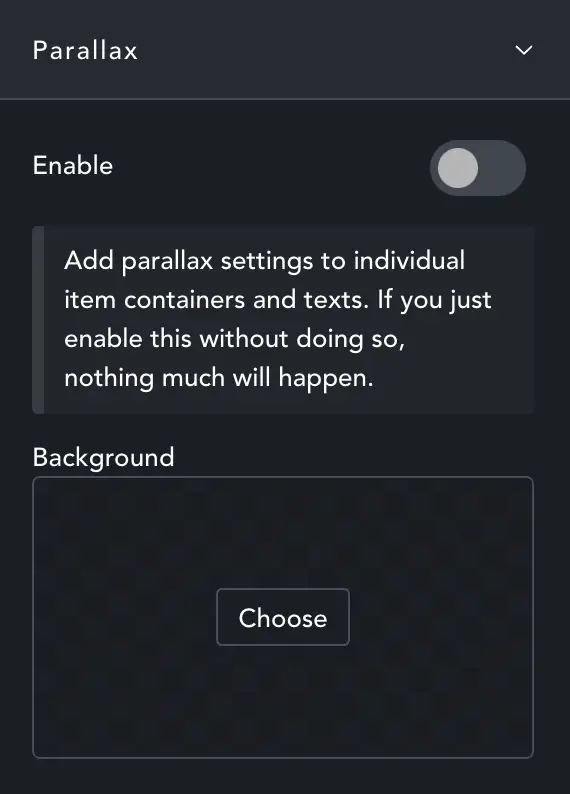
Content – Parallax
Enable Parallax. If you want a single image behind the whole slider, moving very slowly… choose that image here. Then you need to go to individual slides to set-up parallax for each one.
For each slide you add there is now a Parallax option. Every option, Image, Heading and Text has the same controls, so we’ll just look at image.
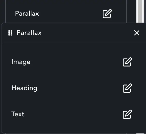
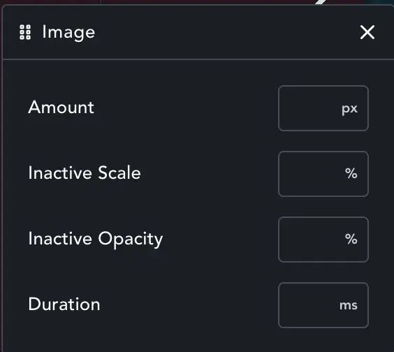
Parallax – Image
For more info: https://swiperjs.com/swiper-api#parallax
With Parallax enabled, you can set the amount of extra movement for the main image. Set this in px, and the slide will move more (+ race ahead) or less (- drag behind) by that amount, creating the Parallax effect.
Inactive Scale – Inactive slides can also be scaled down or up, to add depth to the effect.
Inactive Opacity – Inactive slides can also be faded.
Duration – How long it takes for the slide to ‘catch up’ – or to make the extra distance specified in Amount.
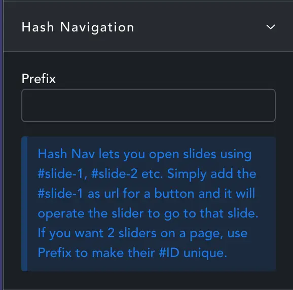
Hash Navigation
For more info: https://swiperjs.com/swiper-api#hash-navigation
Hash Navigation allows you to do two things. First you can open the page with a specific slide showing: mypage/#my-slide-number
Second, you can use any item to open a specific slide, a button or link wrapper only needs to have #my-slide-number as the link.
Prefix – By default the slides are #slide-1, #slide-2 etc. If you have more than one slider this can create duplicate IDs. Prefix will add a prefix to the id. A prefix of “sf-” will make slides #sf-slide-1 etc. so you can have multiple sliders with Hash Navigation enabled.
Once enabled go to Hash Navigation in Design to decide how it should work.
Design
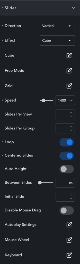
Slider Panel
Direction – Horizontal or vertical slide movement.
Effect – Which Effect to use. We now have Cube, Creative and Cards as extra effects. Most of the effects have their own settings, and those settings are pretty obvious so we’ll just look at the exceptions.
Cards Effect – The cards effect is quite bad if you use pagination. It’s only really effective if slides are changed with mouse drag.
Creative Effect – The Creative Effect allows you to build your own effects from scratch. BE WARNED! even the smallest error, like a missed comma, will break the slider. So follow the placeholder guide EXACTLY. Root: ends with a comma, Prev and Next do not.
To understand how it works see: https://swiperjs.com/swiper-api#creative-effect
There will be some example settings in the docs (as soon as I’ve written them!)
Free Mode – lets the slides move freely based on touch or drag momentum. Unlike regular mode, it doesn’t “snap” to the next slide, unless you choose ‘Sticky’, then it will ‘come to rest’ showing a full slide rather than ‘anywhere it lands’.
Minimum velocity decides how fast you should ‘flick’ the slider to get free-scrolling, and momentum is like ‘easing’, it will take a little time to slow and stop.
Grid – You can display slides in a grid. Choose to fill by row or column, and select the number of rows. The number of columns is decided by ‘slides per view’
Speed – Time taken to move from slide 1 to 2.
Slides Per View – How many slides in view at any times. Set to 1.5 to have next/prev slides partially in view. Works with Grid to set number of columns.
Slides Per Group – How many slides to move per ‘gesture’.
Loop – loop slides continually – otherwise it will stop at the last slide.
Centered Slides – Should the slide be centred in view.
Auto Height – Determine slider height based on the tallest slide.
Initial Slide – Which slide should be displayed on page-load.
Disable Mouse Drag – Don’t allow slides to be changed on drag.
Mouse Wheel – You can have the slider move based on mousewheel. If you made the slider 100vw, it’s almost a horizontal scroll. More info: https://swiperjs.com/swiper-api#mousewheel-control
Keyboard – Enable keyboard navigation.
Thumbnails Panel
You can now make thumbnail sliders by just choosing ‘enable’ on thumbnails! Thumbnail margins are now more intuitive. The old method was trying to be too clever! Now you set margins for thumbnails in a way that is clear and makes sense.
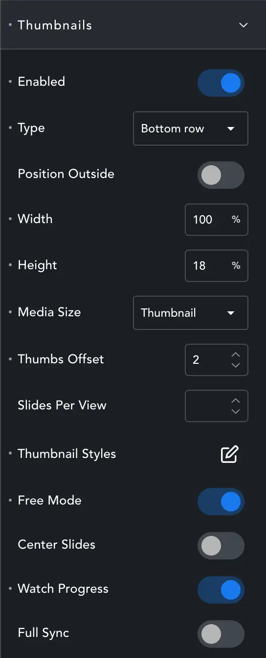
Anchor – Choose where you want to anchor the thumbnails, top, bottom, left or right (vertical). If you anchor bottom but set the height to 100%, then they will still sit at the top! But then you won’t be able to navigate because the thumb-wrapper will cover your buttons. Hence ‘Anchor’ not ‘position’. Anchor to bottom, set height 10% and they will sit where expected.
Anchor Outside – When placing thumbnails they are css position:absolute; and the main slider is the relative parent. If you want, the thumbnails can be positioned ‘outside’ the main slider.
They can only go ‘so far outside’, since they will still be contained by the section-container they are in.
Width/Height – When choosing width/height – it all depends on whether the thumbnails are vertical or horizontal. Choose appropriately. For horizontal (top or bottom) 100% is the width of the parent slider, so a good width. A height of maybe 120px, or 12% works well.
For left/right column, do the opposite. Make the height 100%, or a little less if desired, and the width around 15% or 150px.
The width and height here are for the thumbnail container – not the thumbs themselves (see below).
Wrapper Margins – Once the wrapper is sized, you can then nudge it to the required position by setting the wrapper margins.
Remember to swap! If you switch from vertical to horizontal thumbs they will look completely wrong at first. Don’t panic! Just adjust the Width, Height and wrapper margins. You may also want to change thumbnail size (see below).
Media Size – Choose which media size to use for the thumbs.
Thumbs Offset – The active thumb is the first thumb in the slider by default. If you have 5 Thumbs in view, and want the middle one to be the ‘active’ thumb, offset by 2.
Slide Per View – how many thumbs in view.
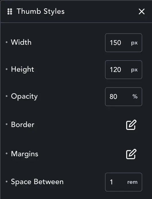
Thumb Styles
Thumb margins actually make no sense, so have been removed. Now there is a simple ‘Gap’ which will decide the spacing between slides. Position and margin are set in the width/height and margin settings above.
Use Thumbnail Styles to set the general ‘inactive’ style. Use Active Thumbnail Styles to style the currently selected thumbnail.
Thumb Text
When enabled the Title of your slide is added to the thumbnail. This can be very helpful if your slides have a background-color and content but not image, as it helps make the slides distinct. Titles are cut off at 20characters to keep them from overflowing. You can style the text with the Typography option in the usual way.
Watch Progress – Will add a ‘visible’ class to slides in view. You can use this in custom CSS if you need more style options than in the settings.
Full Sync – Will lock the thumbs and main slider together so when one is navigated, the other is also moved. DO NOT USE THIS with Loop enabled. Since the number of slides in view for thumbs and the main slide are usually very different, Loop and Full Sync will make them lose track and navigation of thumbs will be a mess.
Hash Navigation
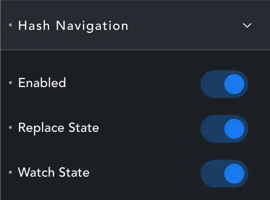
Enable hash navigation to be able to open a specific slide from another page (my-page/#my-slide-to-show). You can also use buttons or link-wrappers to navigate the slider.
Replace State – Will replace the #tag part of the URL without adding to history (so the back button won’t go through all the #slides you have clicked)
Watch State – This enables on-page #navigation – as Swiper will listen for #url-changes and navigate the slider accordingly.