Content
Type
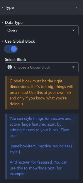
Data Type – Choose Default, Repeater or Query as your item source.
Panel Gallery currently supports a Title, Excerpt and Image. You can use standard post fields and meta, custom post types, and ACF/Meta Box fields attached to posts.
You can then style the gallery as you want. Alternatively, choose Global Block and you can select your block to use as a panel. This opens up the possibility of using whatever dynamic data you want.
In global block mode, you can use classes on items to have them show/hide or change styles. Add a class of .active, and the item will have thos styles when it’s the featured item. Add .inactive and those styles apply to clickable, not featured items.
Query Type
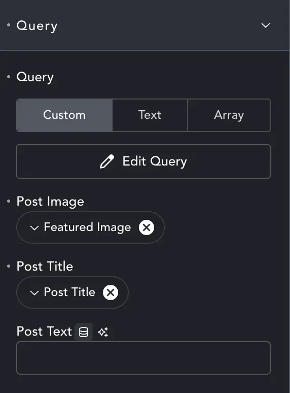
After selecting Query as your Data Type you’ll see the Query tab in content settings. The Query itself is the native Breakdance query – set it as normal. Panel Gallery accepts a max of 27 items. It will ignore any after that. But for peformance sake you should set Total Posts in the query to restrict them if there are more than you want to display.
Each field is as Post Text initially, empty, but you shouldn’t type anything in them. Click the dynamic data icon instead and select the field you want from the Breakdance dialogue.
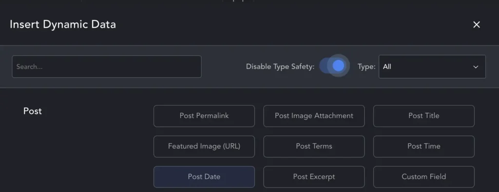
Not all fields will show. You can find them by selecting All from the top-right drop-down, and then enable the Disable Type Safety toggle. Now you should see all fields, including featured image and any fields you’ve added with ACF/Metabox etc.
You can also change settings for each field as with standard Breakdance dynamic fields. For images you can set size, for text you can set max characters.
Repeater
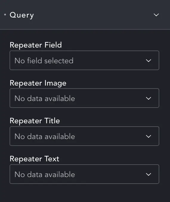
ACF/MetaBox repeaters need to be attached to the page Panel Gallery will be on. Then you can use the drop-downs to select:
The main Repeater Field
The sub-field which holds the Repeater Image, Title and Text.
All available rows will be loaded, up to 27 max.
Default
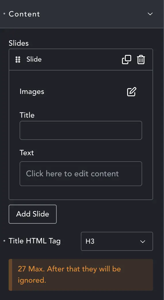
You can also add items manually. For each slide you can add the Image, some Title text, and some paragraph Text.
The Image option also allows you to select the image size, and set the alt text. Alt Text is not currently supported as these are background images.
The Title HTML Tag sets the tag for the title, which will then inherit that style. You can over-ride the style in Style options (see below).
Styles
Container
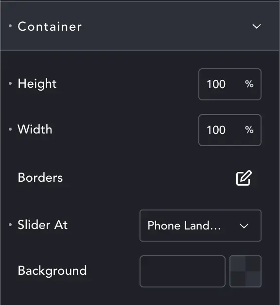
This is the main container. For larger galleries it’s best to leave this at 100% x 100% size and let Panel Gallery work out the dimensions for you. Whatever size you choose, PG will work out the size of items so they all fit in.
You can also set a Border and Background color.
Slider At – decides the breakpoint at which PG becomes a slider.
Typography
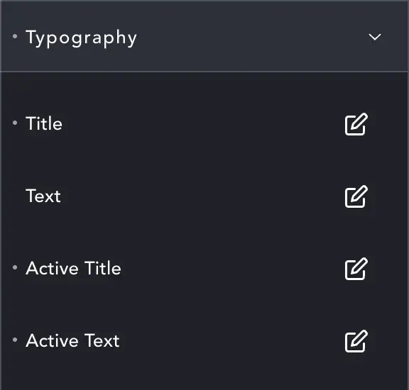
Standard Breakdance typography settings. Title and Text are for inactive items. Currently text is hidden when not the featured item, this setting may remain or be removed depending on if I find a useful way to show the text.
Active Title / Active Text are for the featured item.
Grid
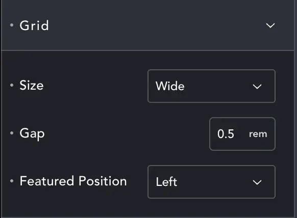
There are 3 size options, Small, Medium and Wide. Small is square and can show up to 6 items in a 3×3 grid (5 small 1 x 1, and 1 featured 2 x 2 size). Medium is square with a maximum of 17 items in a 4×4 grid. Wide can display 27 in a rectangular grid of 7×5.
The Gap is between items. The Featured Position controls where in the grid the large item is.
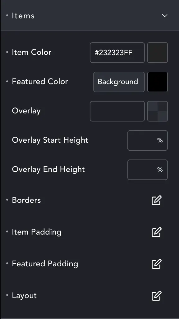
Items
Here you can set the styles for items. The Overlay also has height control. You might have it set to full height (100%) when inactive (Start), and 50% when featured (End) to only cover the text area.
Layout gives you Flex settings for the items, so you can align their content and set the gap.
Panel Gallery creates grids automatically and randomises them. You might have 20 items, and so would choose the wide style, which leaves 7 empty spaces. These will be filled with placeholders which are given the Item Color with a randomised opacity to create a pleasing look. You might, then, deliberately choose a larger grid than you need for a small number of items, just because it looks nice.
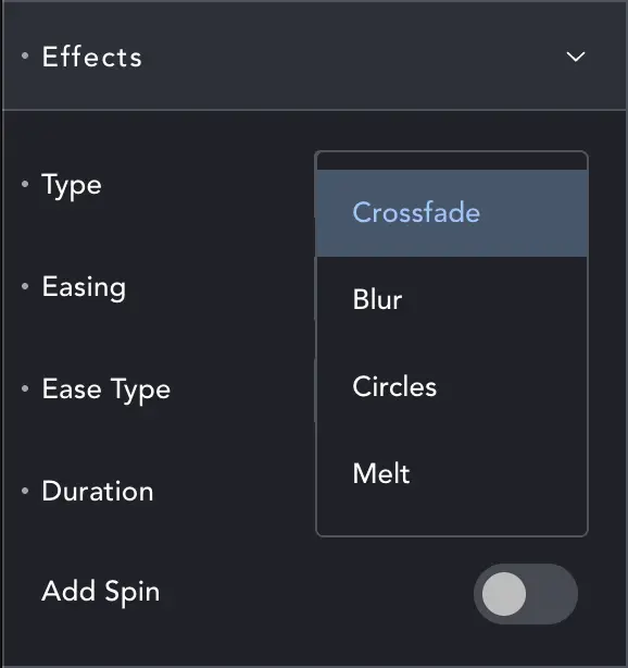
Effects
Panel Gallery has a few transitions. Crossfade and Blur add fade or blur as items swap; Melt adds both fade and blur. Circles turns items into circles, and then animates their transition to squares. Leave this blank for a plain swap.
You can also set the easing type and duration.
Add Spin will add a spin to items as they swap.
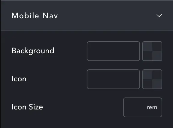
Container
As a slider Panel Gallery has a nav-bar left and right with <> icons. You can change the color of these bars and icons here along with the icon size.
Notes on the slider mode
Currently when we collapse it’s to a simple slider. Slides are placed in a very wide container which is animated left and right. This allows us to leave the grid in place and makes collapse/rebuild on desktop resize incredibly quick. It also means minimal DOM changes and a UI that work naturally across devices. These are strong benefits.
All the same I have a better slider (conditional loading, wrap-around etc.) on the roadmap. Right now I can’t give a date for it.