Classy is a simple element which toggles a class on another element or itself. You can add elements inside Classy and they can then be re-styled with the class, or target another element. Classy itself doesn’t appear on the page or take any height/width in the DOM.
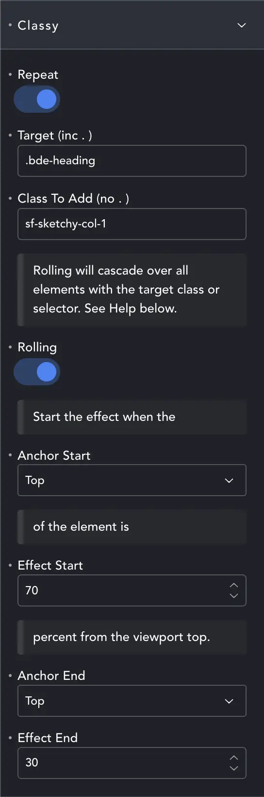
Settings
Repeat – when disabled items will be given the class and it will stick. Enabled, items will have the class added and removed at the specified triggers.
Target – is the class or ID we wish to target. You need to specify which using the normal selector – a dot or #.
Class To Add – is the class added/toggled. This must be a class so no need for the dot.
Rolling – when disabled only the first target will get the class toggled. Enabled and every target on the page will get the class toggled.
Anchor Start – Which part of the target are we using as the Anchor.
Effect Start – Where the anchor is when the class is added. This is a percentage from top.
Choose Anchor Top and Start 70% – and the class will be added when the TOP of the target is 70% from the top of the screen.
Anchor / Effect End – Determines when the class is removed again (if in Repeat mode).
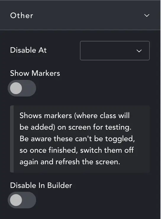
Other
Disable At – Choose the breakpoint at which classes will no longer be toggled. If we are resizing on desktop, classes will be removed at the breakpoint. If loaded on mobile, classes will never be added.
Show Markers – Useful for debugging. They will show where GSAP has marked the start and end of toggles.
Disable In Builder – in case you don’t want to toggle the classes as you build.