NEW!
Carouser used to be built and driven with javascript, using GSAP and Scrolltrigger to enable some animation and mouse-controls. Now it’s been completely rewritten to use CSS to build the carousel, with a tiny script for the navigation. That’s about 70k smaller, and doing the calculations in CSS is lighter too.
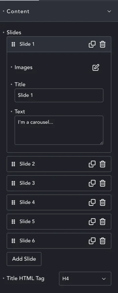
Creating Slides
Carouser works best with between 3 and 8 images, although you are free to add more. Each image is a Slide and you can add the Image, some Title text, and some paragraph Text.
The Image option also allows you to select the image size, and set the alt text.
The Title HTML Tag sets the tag for the title, which will then inherit that style. You can over-ride the style in Style options (see below).
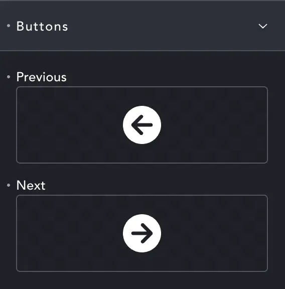
Buttons
Here you can choose the icons for the navigation buttons.
Size and style are set in the Style tab (see below)
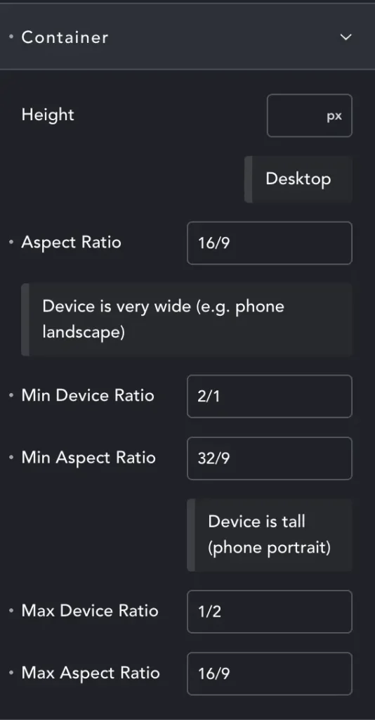
Rather than Width and Height – we have height combined with Aspect Ratio (AR).
The first AR is for default ‘desktop’ – but will generally work on any ‘wider than it is tall’ screen.
Min Device Ratio – We’ve entered 2/1. This means that at minimum our screen must be twice as wide as it is tall.
For most phones in landscape this media query will activate. Now we have the element at 32/9 – twice as wide as the desktop AR. Happily it often makes the element look right.
Max Device Ratio – Here we have tall screens. While it may seem there are none (save the rare DTP screens) – we need to remember users may not have full-screen browsers. You can have three browser windows at once on an ultra-wide monitor, and then they might be taller than they are wide.
Almost all mobiles are also portrait. Generally we will shrink our element – it will continue to be 16/9, just not very tall, maybe 40vh. But you may want to target this layout exactly because most phones are portrait. In this case you can make your ‘desktop’ AR 18/9, making the element tall even on desktop, and perfect on portrait phones.
I bang on about this more here: Media Query Article
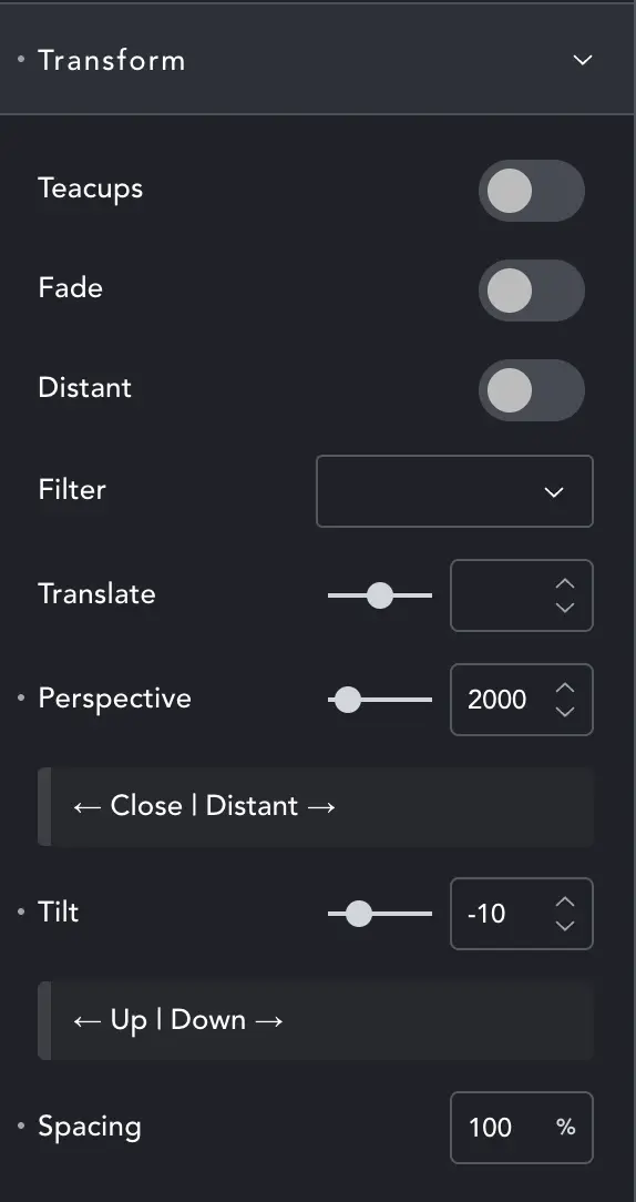
Transform
These are the main controls for how the Carouser behaves.
Teacups will spin the images on their own axis and around the centre – like the teacups rides at the fairground (see below).
Fade – Images will fade as they near the back of the carousel.
Distant – Stretches the carousel to give more depth. In essence it amplifies the Perspective and can be used along with this control.
Filter – Adds various filters like grayscale or blur. Some style the whole carousel, others increase their effect as the slide moves into the distance.
CHANGE – Spacing is moved to IMAGE
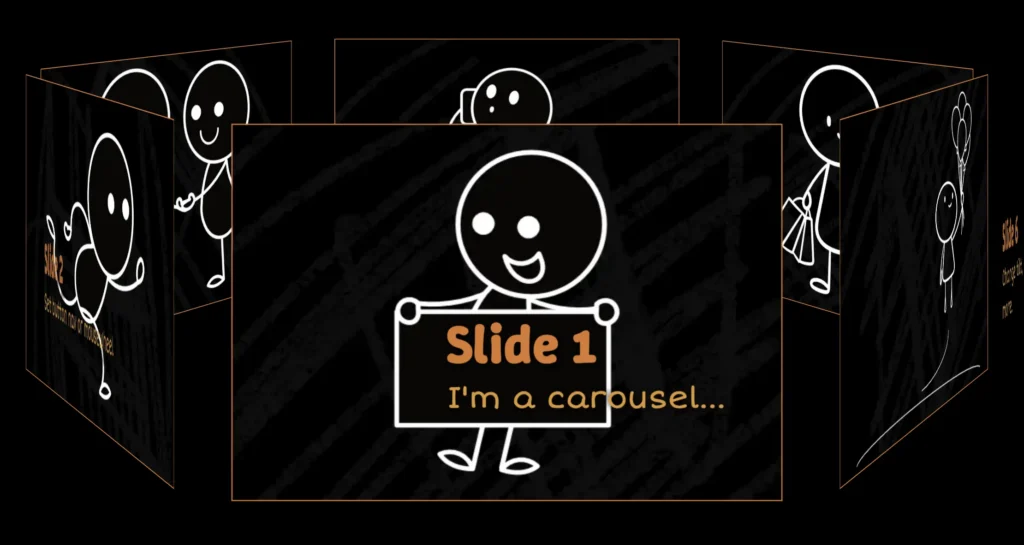
Normal mode Carouser
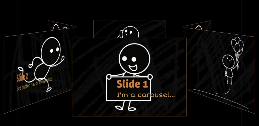
Teacups mode Carouser
Translate – As the slider uses absolute positioning, you may need to adjust the vertical offset. This will move the slider up/down in its container to prevent it overlapping next/previous content.
Perspective – Will change how ‘far away’ the back slides are, and how close the near slides, to adjust the sense of depth.
Tilt – Changes the ‘angle of the ground’, the tilt of the whole carousel.
Spacing – (Moved to image settings) set spacing for a wide gap, or even to deliberately overlap slides. Spacing can also be adjusted per breakpoint, working with slide size to ensure it looks right on all devices.
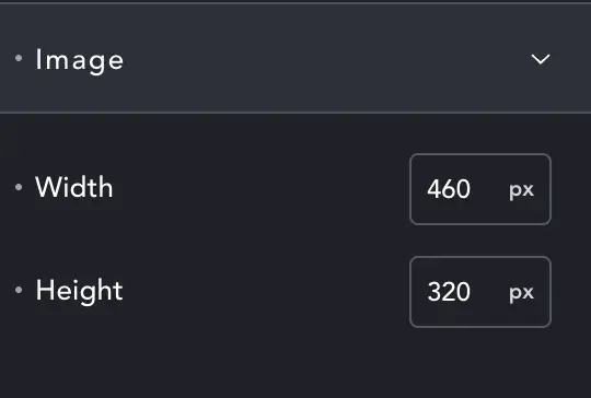
Image
Controls the size of the image. The actual size of images may vary slightly, as Carouser calculates the best way to fit them all in.
You can change size per-breakpoint.
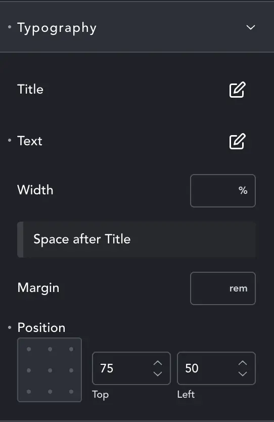
Typography
Change styles for the Title and Text as with general Breakdance Typography settings.
Width – Will change the width of text, relative to slide size.
Margin – controls the gap between title and text.
Position – The text box can be placed relative to the slide. Visualise the grey box as the slide and place your text accordingly.
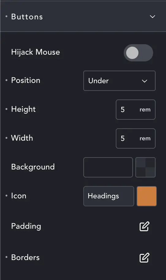
Buttons
Here you can style the navigation buttons. You can also Hijack Mouse. This will make the scroll-wheel drive the carousel when it is being hovered.
User generally don’t like things being forced on them, so it’s very lightweight, and easy for users to scroll past without being stopped by the carousel. Better that we fail to grab the mouse sometimes, than that we aggressively grab it and annoy visitors.
Other controls are the same as Breakdance generaly styling controls.