AKA Why width based breakpoints don’t work anymore.
If you’re a lucky fish, your elements will look great across all devices. But there are some situations where even the best designed elements struggle. I’ve put weeks of development into making these elements stable, yet I can get caught out by some responsive gotchas that can make you think you’re going mad. So here’s a quick guide to getting better results, especially from horizontal elements, any 3D elements like Carouser and Momma Tilt.
Understanding Aspect Ratios and Responsive Design
Modern devices come in all shapes and sizes, phones, tablets, monitors, foldables… even with phones, one ‘HD’ phone screen won’t be the same number of actual pixels wide or tall as another ‘HD’ phone. Ye olde responsive design relied on width-based breakpoints, but this approach is no longer enough. A screen’s aspect ratio — the relationship between its width and height — can dramatically affect how content appears.
I spent many hours raging at the screen because my CSS for mobile landscape didn’t work. Then did what a less sleep-deprived idiot would have done in the beginning, and measured my phone screen. It turns out that my phone is 870px x 411px in landscape. When my phone was landscape it was too wide for Breakdance’s default phone breakpoint, so got the tablet portrait styles instead. It made stuff look like crap, bleeding off the screen or tiny and unusable.
Breakdance, like most visual builders, uses width-based media queries. This is not a flaw — it’s a
simplification that covers most use cases. However, when designing elements that depend on
shape (such as Carouser and PanelBox ratios, grids, or viewport-based animations), you may need more
control than simple width breakpoints allow.
Using Aspect Ratio Media Queries
CSS supports media queries based on aspect ratio. For example: @media (min-aspect-ratio: 3/2) {
.my-element { aspect-ratio: 16/9; } } This query applies when the device’s screen is at least 3 units
wide for every 2 units tall. You can also use max-aspect-ratio for the opposite condition.
This allows us to set our container so that it works for the element inside based on shape. Combined with viewport units (vw, vmin, svh etc.) we can make an element work on any screen, not based on pixels but shape.
| Query | Ratio | Type |
|---|---|---|
max-aspect-ratio: 3/2 | ~1.5:1 | Tablets portrait-ish |
min-aspect-ratio: 16/9 | 1.78:1 | Typical widescreen (desktop, landscape phone) |
min-aspect-ratio: 18/9 | 2:1 | Many modern phones in landscape |
min-aspect-ratio: 21/9 | 2.33:1 | “Ultra-wide” phones or monitors |
Non-Standard Screen Shapes
Devices with unusual shapes (for example, 20:9 phones or ultrawide monitors) can look completely
different even when they share the same width in pixels. This is why aspect-ratio–based queries
can save hours of debugging. If your element looks right on desktop and tablet but not on mobile —
it may not be that the element is broken or fails responsiveness.
Carouser and Momma Tilt now have a set of aspect-ratio controls which mean you can resolve issues like this.
When using aspect ratio just keep in your head [wide / tall]
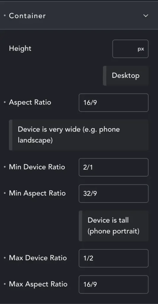
Rather than Width and Height – we have height combined with Aspect Ratio (AR).
The first AR is for default ‘desktop’ – but will generally work on any ‘wider than it is tall’ screen.
Min Device Ratio – We’ve entered 2/1. This means that at minimum our screen must be twice as wide as it is tall.
Remembering my stupid phone, it has a screen 870×411… so more than twice as wide as it is tall. This media query will activate. Now we have the element at 32/9 – twice as wide as the desktop AR. Happily it does indeed make the element look right.
Max Device Ratio – Here we have tall screens. While it may seem there are none (save the rare DTP screens) – we need to remember users may not have full-screen browsers. You can have three browser windows at once on an ultra-wide monitor, and then they might be taller than they are wide.
Almost all mobiles are also portrait. Generally we will shrink our element – it will continue to be 16/9, just not very tall, maybe 40vh. But you may want to target this layout exactly because most phones are portrait. Mobile first is a thing you know 😉 In this case you can make your ‘desktop’ AR 18/9, making the element tall even on desktop, and perfect on portrait phones.
I will look at how I might facilitate better media queries for elements that need them. Meanwhile, you can over-ride width/height etc. in custom media queries in your own stylesheets. Using the old-faithful right-click inspect to find class names for elements, and then adding that class in a media query.
Given the absurd range of devices and whatnot – I recommend you keep a large quantity of gin to hand while working on websites – until the golden day when the internet is beamed directly into our eyeballs and we don’t need screens anymore!