General Notes
ScrollSlider works ok in Breakdance, but it can fall over, and – while you’re building with it, it gets very tiring having to scroll past it every time. It’s lovely for visitors who enjoy the novelty, but trust me it gets old for the devs.
For that reason it’s disabled, and you will see a horizontal scroll-bar which let’s you get to the slides to edit and preview them.
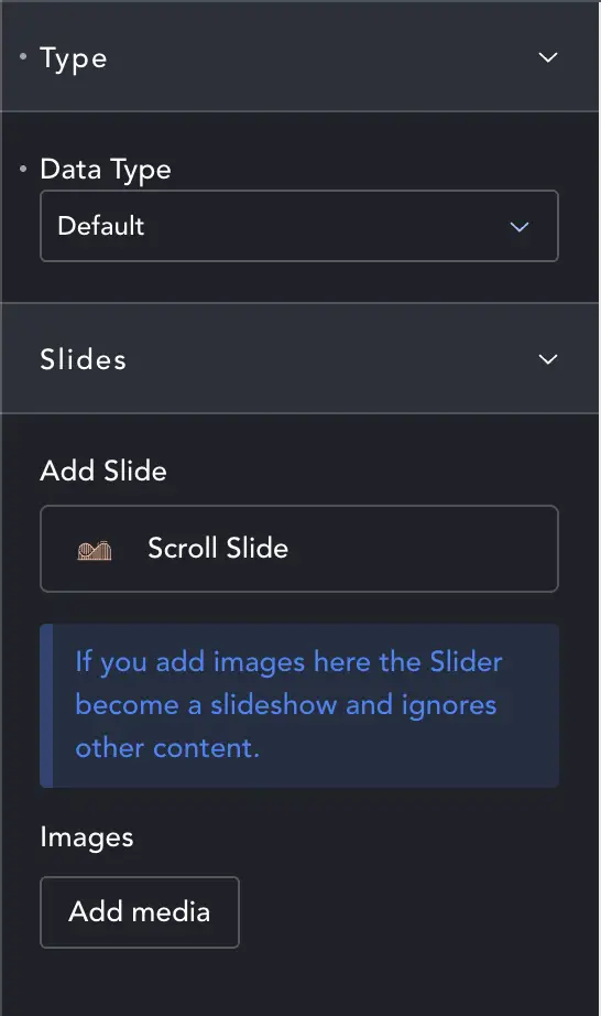
Slides – Default Mode
ScrollSlider starts with 3 slides. Add another by clicking Scroll Slide (or duplicate an existing slide, or ‘Add’ Scroll Slide in the normal Breakdance way).
An optional mode is as an image slider. To save time making slides and adding backgrounds, you can just add a selection of images in one go. If you have any images added here, ScrollSlider will behave like an image slider and ignore any Scroll Slide sections you add.
As an image slider there are no captions, text etc. (maybe in a later version). If you want captions you need to use a different mode.
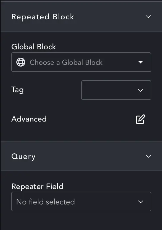
Slides – Repeater Mode
Create a global block. This must be set at the right size (default 100vw x 100vh) to suit how you will set-up the scroller. If your scroller is 50vw x 50vh, keep the global block content within that size. Otherwise things will be cut-off.
Then select your global block here. You can change the tag, and add alternates etc. as with the normal Breakdance global blocks. Finally you can choose the repeater that will feed the global block.
Every repeater item will be used. You will not have individual control of stacking direction as you do in the default.
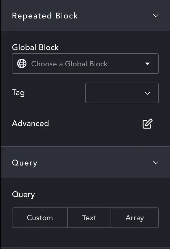
Slides – Query Mode
Query mode is identical to using queries anywhere in Breakdance. As with repeater, you should create an appropriate global block and select it here, along with the tag and alternates if required.
Then set-up your query however you prefer. The only important part is that you set total posts and posts per page to whatever number of slides you want to display. There are settings for this in Custom query, but you’ll need to remember to set them for Text or Array types.
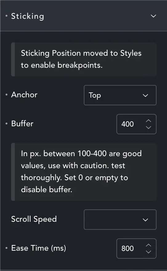
Content – Sticking
Changes – Sticking has moved to Styles and can now be set for every breakpoint.
Anchor – which part of the slider anchors scroll, top or bottom. To stick to the bottom of the screen you would choose Position: 100% (from top) and anchor Bottom. Then when the bottom of the slider hits 100% from top-of-screen it will stick.
Snap – when enabled, sections will snap into place. Not available in Wipe mode.
Buffer – When the ScrollSlider sticks, the change to sideways movement can feel abrupt for users. The Buffer allows a ‘dead scroll’ so the horizontal movement isn’t too sudden.
About 300px usually ensures we don’t switch to horizontal and move most of our first slide before the user realises we’ve gone horizontal.
Scroll Speed – Some effects, and the ‘Snap’ mode, can benefit from being slowed down. For Snap, it means the user won’t scroll too much, and each slide can Snap in place. With effects it can be nice to combine a slower speed with easing to get a buttery scroll.
Scroll Speed doesn’t do any scroll-jacking, it simply ‘makes the ScrollSlider longer’ in effect, so there are no tricks played with the mouse that might interfere with accessibility or other plugins.
Easing – control the ease from one slide to the next when in ‘Snap’, or the ‘friction’ in normal scroll. With no easing, horizontal sections behave just like vertical sections, moving with the mouse. When you apply Easing, the slides take a little time to start and end their movement which make it feel smooth and classy!
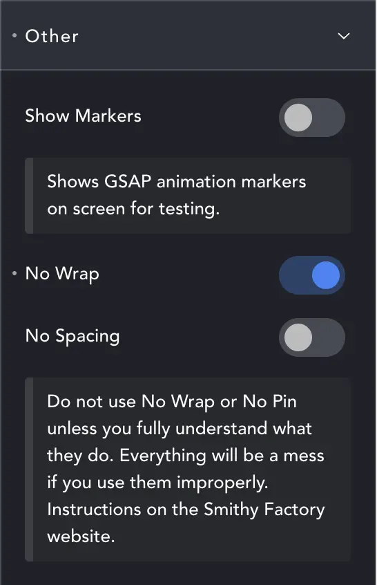
Content – Other
Don’t change these unless you know what you’re doing.
Show Markers – Meant for debug. It will show where GSAP has decided scroll should start and end for all items. If you get unexpected results this can help show why, or at least reassure you GSAP is alive and trying to scroll.
No Wrap / No Spacing – Both these settings can wreck page-layout (but not permanently, just switch them back off!)
In order to Scroll horizontally, we have to ‘fake’ a large amount of vertical space, so the browser thinks there is some scroll happening while we stick our sections in place.
We then ‘grab’ the section above and below and hold them while we scroll our Scroller. Otherwise, with non-full-height sliders, you will see content above continue to scroll up, and content below ‘scroll in’ near the end. This can look really bad, so we pin the above and below – and our ‘fake space’ is neatly off-screen and never seen.
However, for the brave or foolish, you can disable this. The reason you might want to is that it enables one slider to follow another. Normally we can’t do this because we have pinned what’s above and below – and if it’s a Slider above or below the Sliders get tangled up in each-other. Switch off Wrap and you can put one ScrollSlider directly after another (maybe the first to scroll left, the next to scroll right).
No Spacing – will not put the ‘fake spacing below’. If you disable Spacing, you must add the correct amount of space below manually. Example: If you have 5 Slides at 100vw, add an empty section below and make it 500vw high. If you don’t – vertical content will scroll over the slider… but this can actually be a nice effect if used well (put just images in the Scroller, and let content scroll vertically by as images move horizontally, for example).
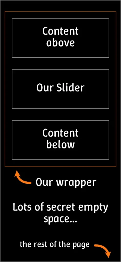
It can be difficult to grasp and if you don’t fully understand the implications, don’t use the options. But it opens up some useful possibilities if you use it properly.
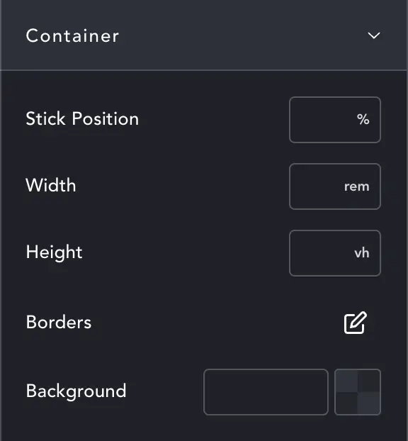
Design – Container
Stick Position – Decides where the scroller will stick as a percentage from top. Full screen scrollers generally stick at zero (default).
Set the overall width of the ScrollSlider. Most common will be 100vw (default), but you might want to have a smaller section.
Height is also default 100vh, again, set the height you want.
Borders and background are for the main element. This means if you border 1px all round, the ‘static’ container will have an outline and/or background color.
Change – You can now set the stick position and height per breakpoint.
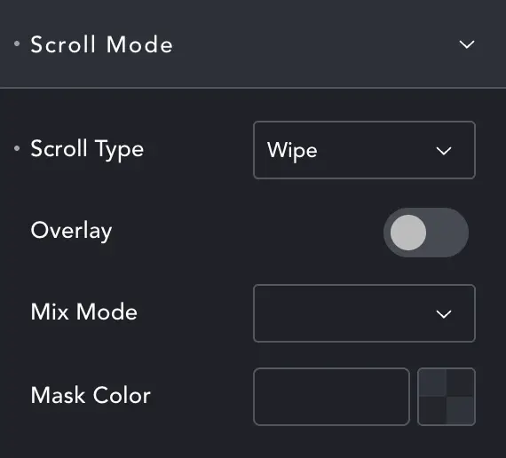
Design – Scroll Mode
A tiny section but this is where a lot of the good stuff lives!
Scroll Type – lets you choose a range of effects (see below)
Overlay – Adds an overlay to ScrollSlider. Most useful for Image mode.
Mix Mode / Mask Color You can set mix-blend-mode on the overlay to create interesting effects. If you set the color to gradient you can fade the effect over different areas, or create a perfect split effect.
Scroll Type
Standard – the regular horizontal Slider. Content scrolls right to left.
Reverse – Scrolls from left to right, ‘opposite’ to the intuitive direction. Don’t forget to build your slides backwards, with the last first.
Wipe – A lovely, almost parallax like effect which uses clipping masks and scroll to create a very high-end looking effect. Vertical Wipe – is the same except… vertical.
Stack – Like the card-stacking effect, sections stop at the screen edge and slide on-top of one another. You can have them scroll in any direction which is set on the child slides. Stack direction per-slide is only available with default slides, not slideshow, query or repeater.
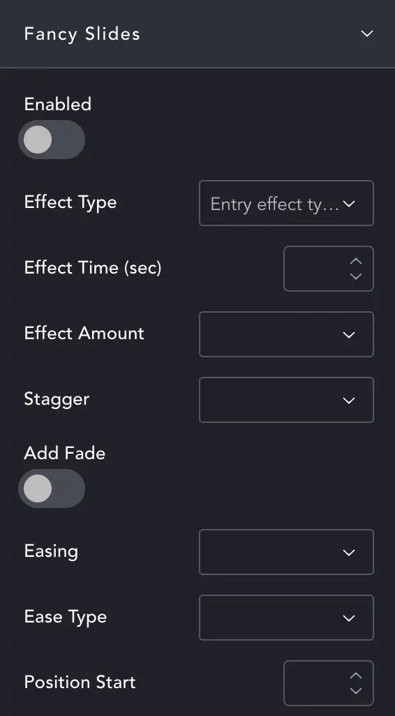
Design – Fancy Slides
Fancy Slides will add an entry animation to your slides. It is quite basic for now, and any effect will apply to all slides.
To keep this page short, here are the basics – feel free to experiment to learn what all the effects do.
Effect Type – Choose how you want elements to enter.
Effect Time – How long the entry animation lasts
Effect Amount – How dramatic the effect is.
Stagger – Each element can enter just after the previous one, to create a pleasing ‘flow’.
Add Fade – Should the elements start hidden and fade in.
Easing – Same as above, choose easing and type
Position Start – Since Slide 1 will be vertical and Slide 2 horizontal, this setting means both % from top (first slide) and % from Left (other slides now moving horizontally) or % from right (if slider is in Reverse).
Caveat – the animations are not great – it’s hard to make them trigger at the right point, and I’ve tried a dozen approaches. Unfortunately you can’t use Breakdance animations as they relay on vertical position… and slides reach vertical position before they come on screen.
I’ve been able to get results but it takes a lot of experimenting with settings.
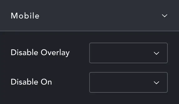
Design – Disable On Mobile
Disable Overlay – If you wish to disable the overlay on mobile.
Disable On – Choose the Breakpoint at which ScrollSlider will disable and all sections are made vertical, normal sections.
Important – When Sections collapse for mobile, they will become ‘content height’ unless you set the height explicitly for mobile. So if Slide 1 has only a heading in it, and Slide 2 has columns with images – Slide 1 will be very short while Slide 2 is tall. This may be perfectly ok, this is just to let you know you need to set the heights if you want different behaviour.
Scroller Navigation
You can add a nav to the scroller so that it acts more like a slider. Add the links anywhere on the page, including inside a horizontal section, and they’ll link to the slide.
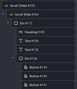
Links should be to ‘#’ – the part that actually does the linking is the data-attribute ‘data-scrollslider’. It’s built of three parts. Every attribute should start ‘scroll-slide-‘ then have the Slider ID and then the slide number.
The image shows a ScrollSlider structure. We can see that its ID is #103. So if we wanted to link to slide 3, we would set the data-scrollslider to: ‘scroll-slide-103-3’
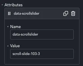
You can see the data attribute set here.
Alternatively, you can open the page to a specific slide simply by including the anchor link: page-name/#scroll-slide-103-3
Currently only Standard and Wipe scrolls work with navigation.