Momma is powered by Atropos.js and the best way to understand how to use it is to have a look over their docs. [https://atroposjs.com/docs]
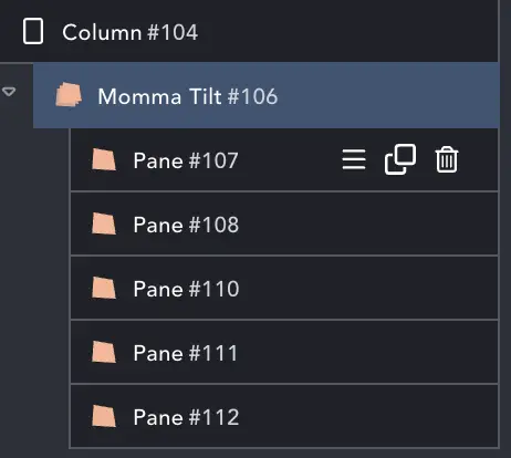
Structure #
Momma Tilt is similar to the Breakdance nested element. Add the Element, and then you can select Add Pane to add a layer to the tilt.
Since Momma relies on absolute positioning and specified size, it can look odd in the builder until settings have been made. You may also want to disable in builder once it’s set-up.
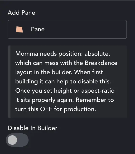
Select Disable In Builder to switch it off in Breakdance.
There are settings in the main element and in each pane in order to get the parallax effect. In Momma you set the ‘global tilt’ and other effects that control how the whole tilt looks.
With each pane you control where it sits in the 3D space, and the content. Each pane is just a div, and can have backgrounds, text, columns etc. Simple content is easier to control, but you can get creative if you want.
Basically, each Pane is a layer in 3D space. You can add just one for a normal tilt (but why!, use Baby Tilt for that!), or any number for complex scenes. In the Pane settings you then choose the ‘translateZ value’, which you can think of as a 3D z-index.
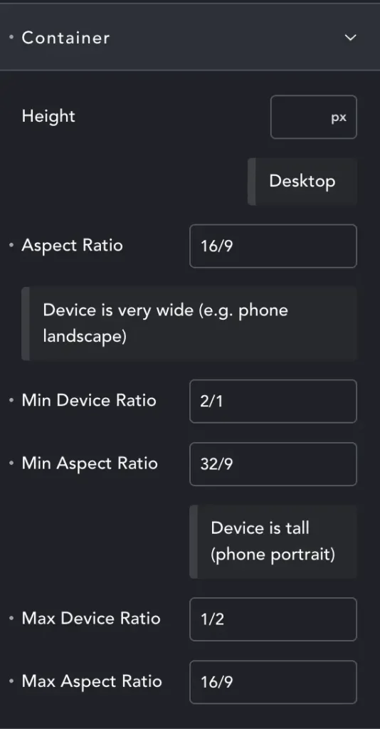
Rather than Width and Height – we have height combined with Aspect Ratio (AR).
The first AR is for default ‘desktop’ – but will generally work on any ‘wider than it is tall’ screen.
Min Device Ratio – We’ve entered 2/1. This means that at minimum our screen must be twice as wide as it is tall.
For most phones in landscape this media query will activate. Now we have the element at 32/9 – twice as wide as the desktop AR. Happily it often makes the element look right.
Max Device Ratio – Here we have tall screens. While it may seem there are none (save the rare DTP screens) – we need to remember users may not have full-screen browsers. You can have three browser windows at once on an ultra-wide monitor, and then they might be taller than they are wide.
Almost all mobiles are also portrait. Generally we will shrink our element – it will continue to be 16/9, just not very tall, maybe 40vh. But you may want to target this layout exactly because most phones are portrait. In this case you can make your ‘desktop’ AR 18/9, making the element tall even on desktop, and perfect on portrait phones.
I bang on about this more here: Media Query Article
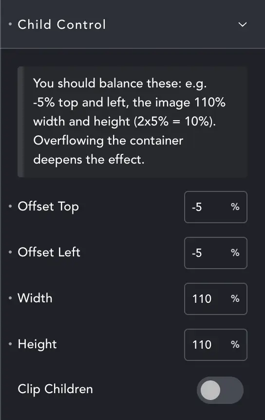
Child Element Control #
Tilting in 3D space often makes an element smaller. Child control allows you to force the backgrounds to be oversized. If you combine oversized backgrounds with Clip Children, it helps prevent the edges of elements showing and spoiling the ‘coherent scene’.
You should then balance settings. 10% oversize (110%) means balance with 5% offsets. Of course you can adjust these to suit a particular effect if you want.
When using regular content, you may not want to clip it, and probably won’t need to adjust sizes or offsets.
Effects #
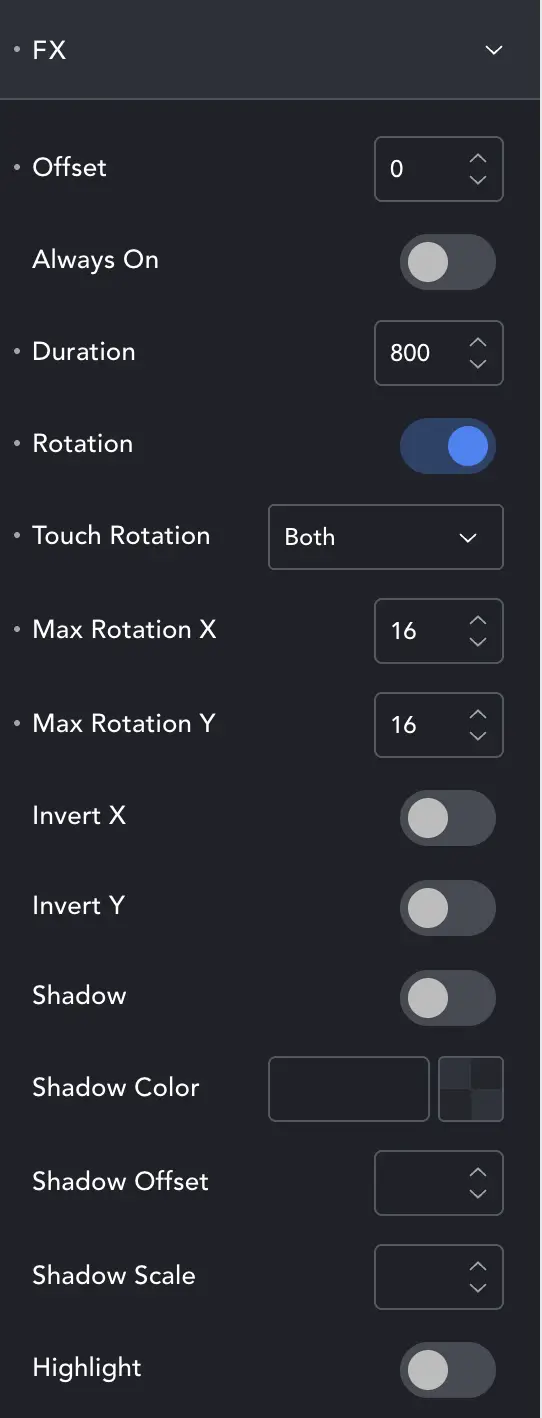
These are the ‘overall effects’, to control the sense of depth, amount of rotation etc.
Offset you can think of as ‘translateZ’ – how much overall depth there is.
Always On will activate Momma on page-load, rather than on first-mouse-hover. If you find a tiny delay before first movement, try enabling this.
Duration – how long it takes Momma to tilt to the full angle.
Rotation – if, for some weird reason, you want to load all this but have no effects, you can disable rotation. I think there must be a reason, but I have no idea. It existed so I wired it up!
Touch Rotation – controls behaviour on mobile. Rotation must be enabled for this to work.
Max Rotation X/Y – how far the tilt will rotate at most.
Invert X/Y – will change direction of the tilt.
Shadow will cast a shadow behind, Highlight will cast a glow behind, the back-most item. You can choose the shadow color and offset, while highlight is merely on or off.
Panes #
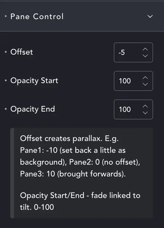
Each Pane allows you to adjust the Offset, which controls how near/far the element appears. -10 will place the item behind the axis, so in the distance. +10 will make the item appear closer.
You can also tie the opacity to the depth, and items will fade or appear relative to their distance from the ‘front’.
If you fade the more distant items it can add to the effect of depth.
Just the tip #
When creating layers I’ve found a couple of methods that work best – you may find others. First, let’s note that we are ignoring text or content layers. These allow you to position content as you would with any other div content, making it simple to position them in 3D space. We’re looking at pure image layers.
With an image layer, you could simply add an image as content, and use Flex, Margins etc. to position it. But this can be tricky if you want to ‘recreate a scene’. Getting everything to line up is a pain.
Method One – The easy way.
You can create your scene in a graphics package, and make all except the back layer transparent. Export each image as the same size. PNG and WebP work well with large areas of the same color, so file sizes will usually remain small. Now you can add each layer as a background image, background-fit:cover. Each element of your scene will be in the right place, mirroring your design.
Method Two – The flexible way
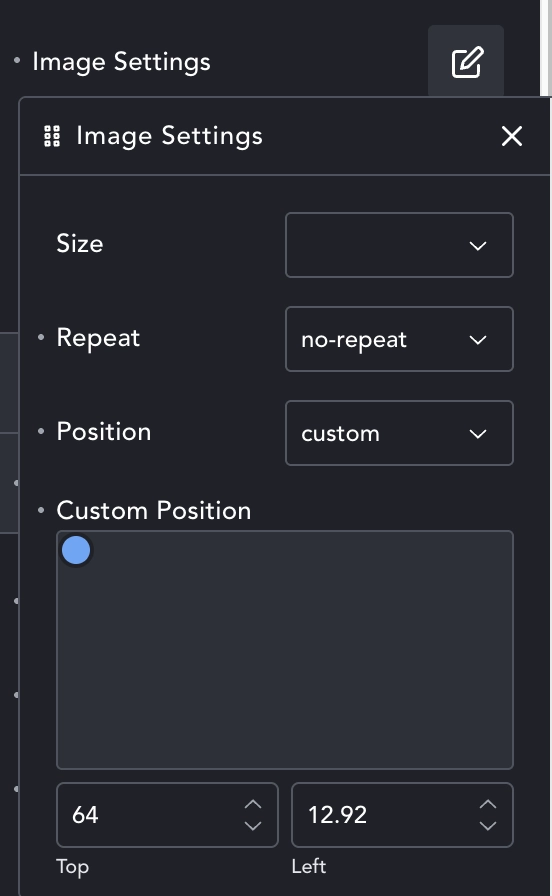
If you export each element in your scene as an individually sized image, you can still set it as a background and easily position it. This time use background-repeat:none, leave background-size as default, and then set background-position as custom. Now you can use the dialogue to place each element pretty precisely.
This gives you the added bonus that you can change layouts per breakpoint.
This is how the Momma Tilt was made in the demo. Each lil-person is a small image, positioned as a background.