FilmBack enables background film-on-scroll. FilmBack is rock-solid up front, but can get a bit tangled round the back… like cheap underwear. Bear with any quirks in the builder. FilmBack is doing some heavy lifting and occasionally falls-out with Breakdance, but a quick refresh fixes any fall-outs… like a cheap underwear.
The key to using FilmBack is to optimise your images. While FilmBack carefully pre-loads a set of images (to prevent a huge page-load), and only loads as needed, you still need to keep images at a reasonable size – or have blistering hosting with caching up the wazoo.
Images
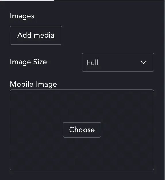
You can add all images at once with the Add Media button. It’s worth knowing that if you add images in bulk, and select them all in Media Library (click image 1, shift click last image) – WordPress will sometimes have loaded images out of sequence. This will look like a jump in the film. So pay close attention when adding images.
Image-size – allows you to choose the media size to use. If it’s a background image it can normally be left at default full-size.
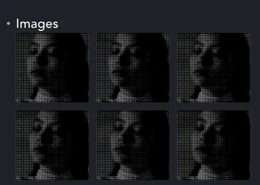
Mobile Image – Here you can select a mobile fallback image. FilmBack works on mobile devices so you don’t need to disable it. But it’s there as an option if needed.
Once images are added you can drag them about to re-order.
Layout
Sidebar has been deprecated.
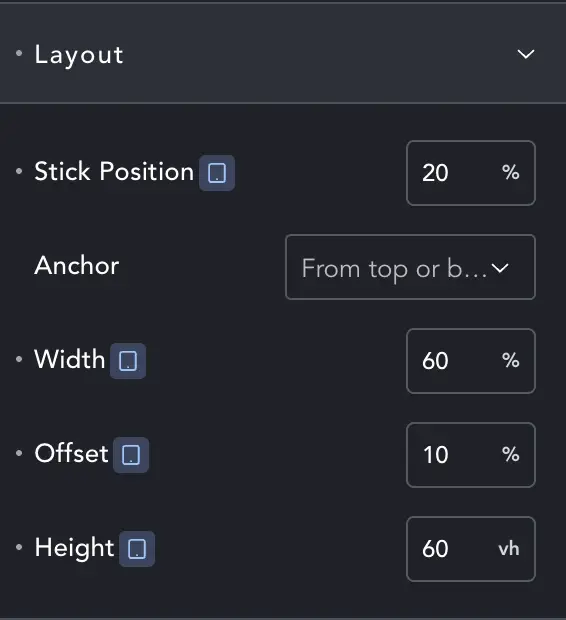
If you want full screen, just set 100 width and height. Now layout enables you to position the background anywhere you want.
Offset – is a margin to the side. It’s always from Left. To pin a 50% width element right, offset by 50%.
To align your 50% width, 50% height background to the middle of the screen, set the offset to 25% (half the remaining space). To align vertically, we change the Stick Position to 25% (see below).
Styles
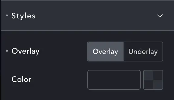
Overlay/Underlay – reveal a color option for a layer to sit on-top or underneath the FilmBack images.
If you have semi-transparent images or the element isn’t full-screen, the Underlay option can set a background color.